CASE STUDY: Expanding a website for a food professional
Some context about the project
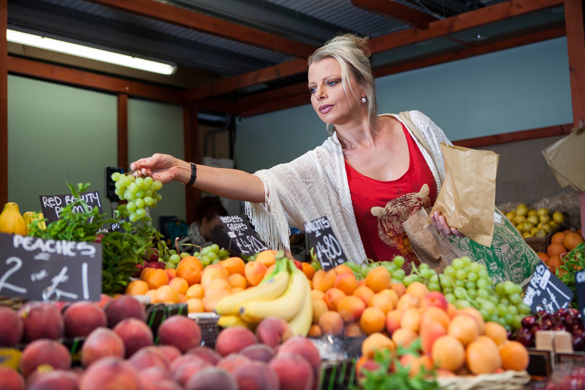
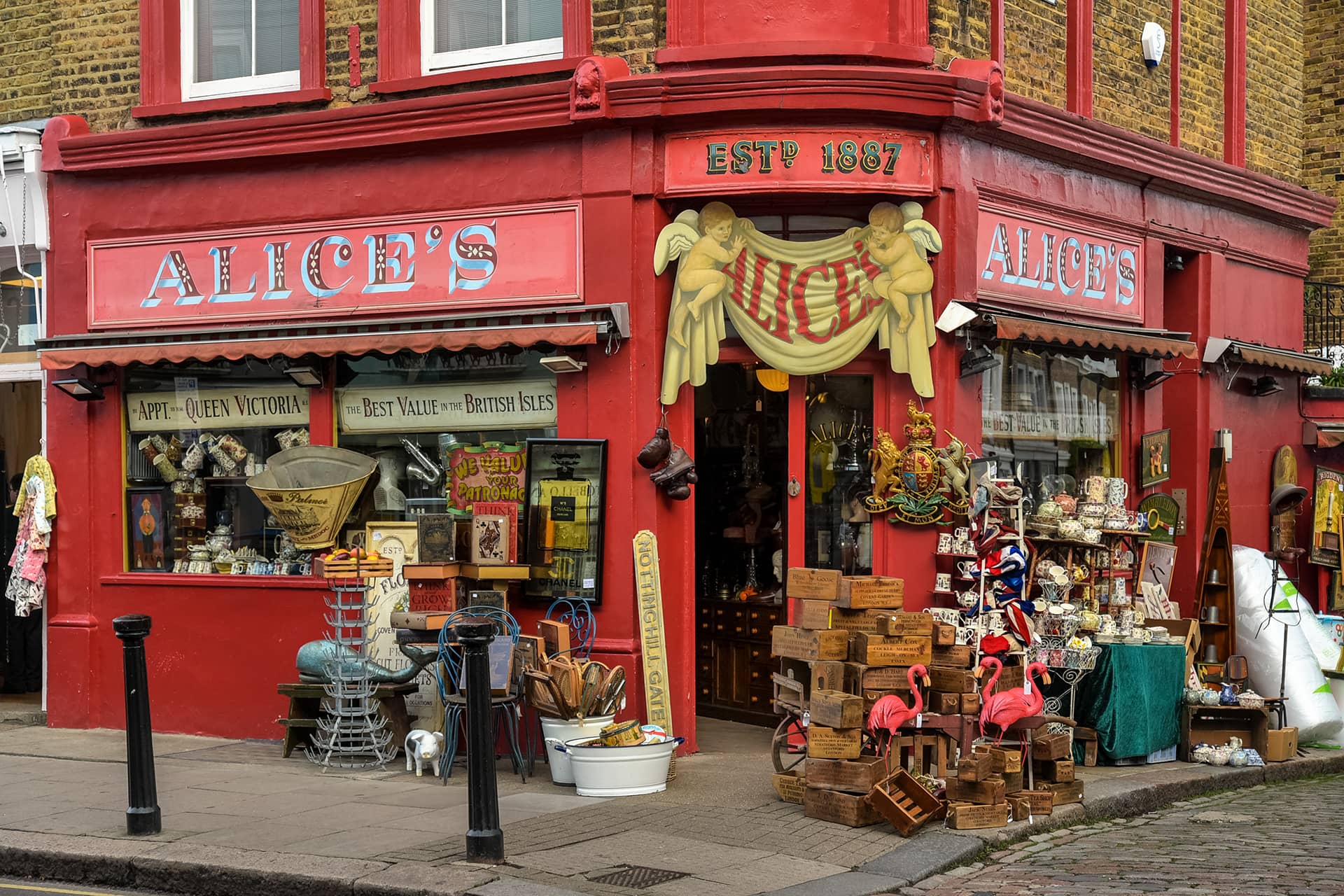
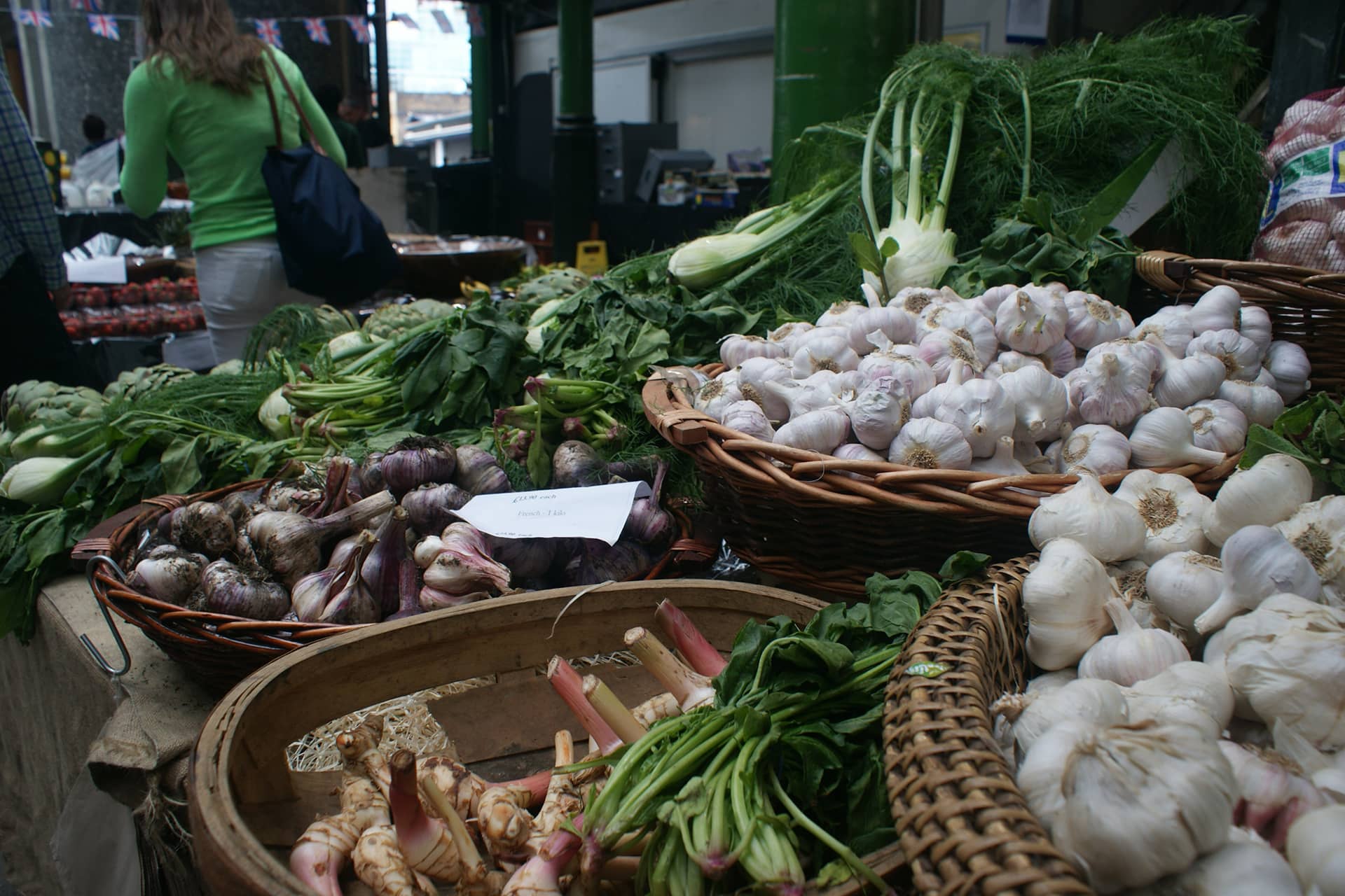
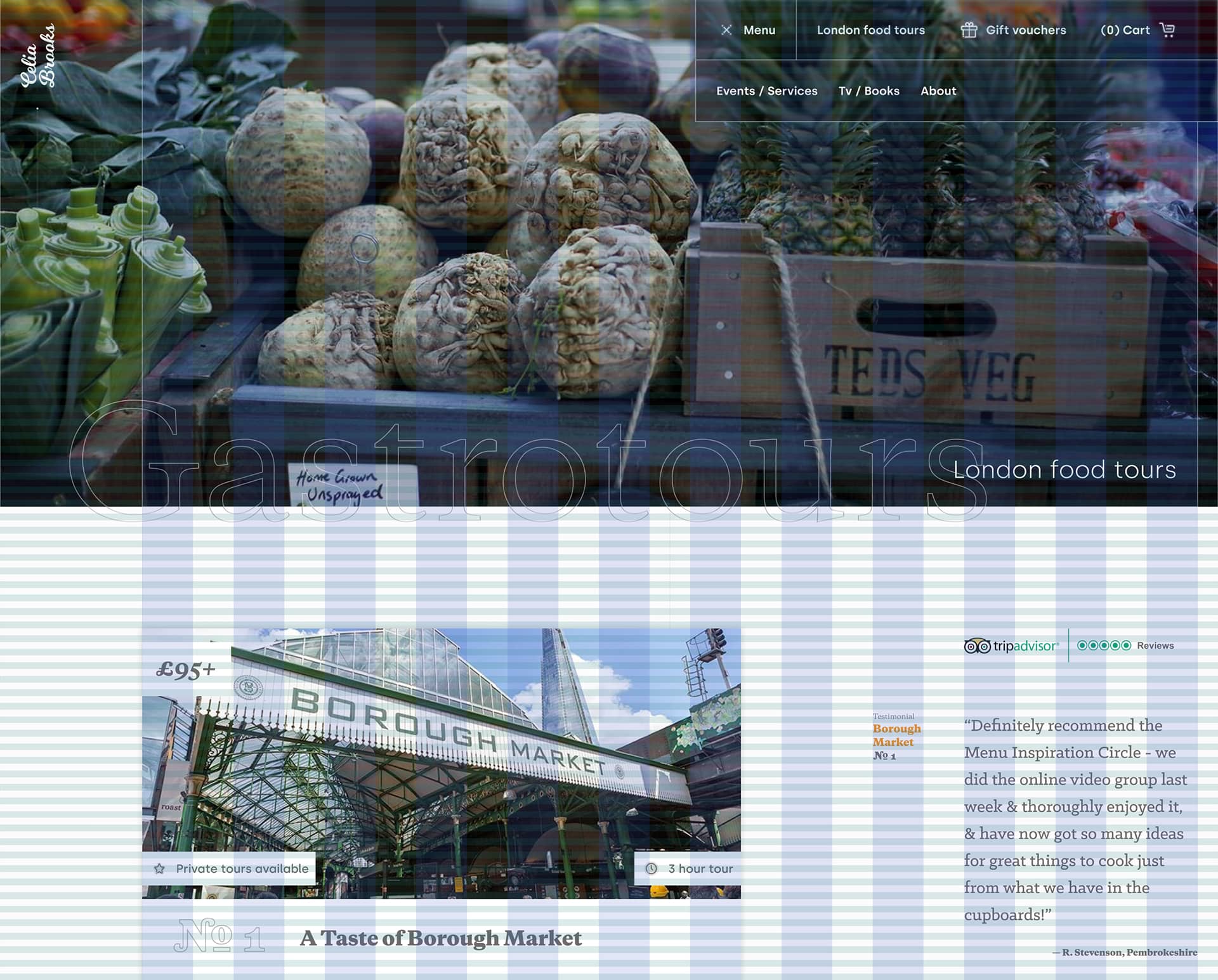
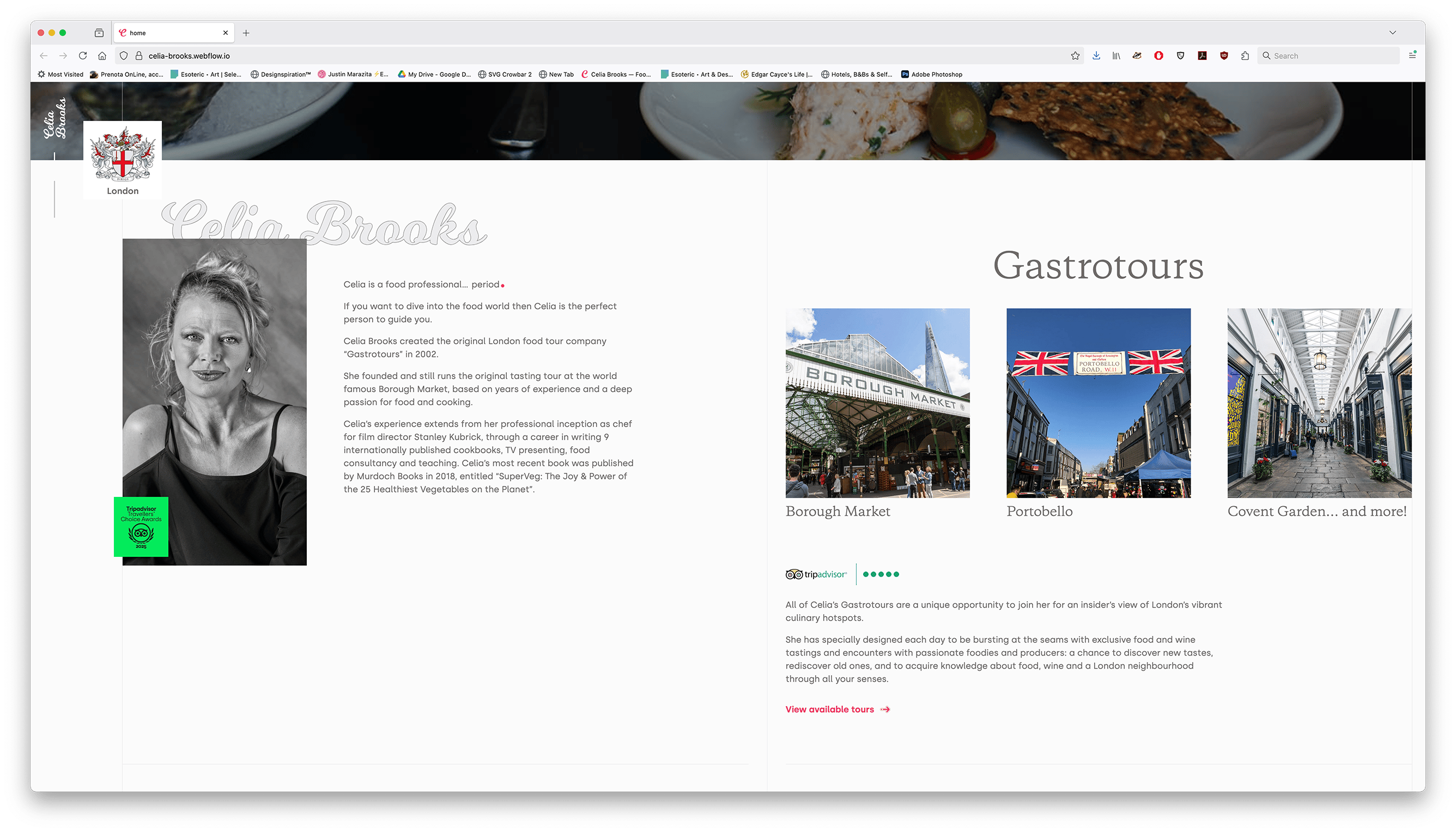
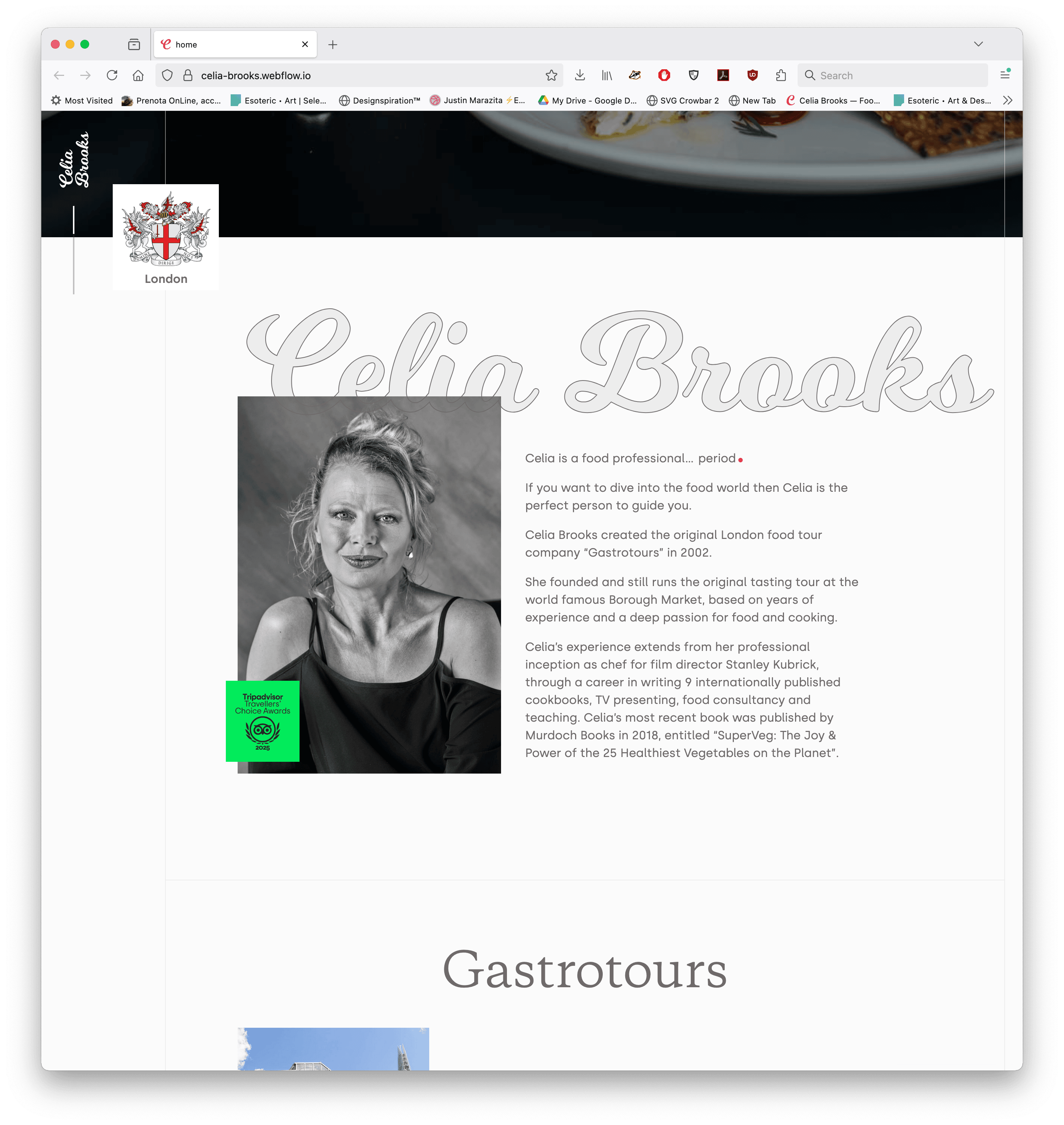
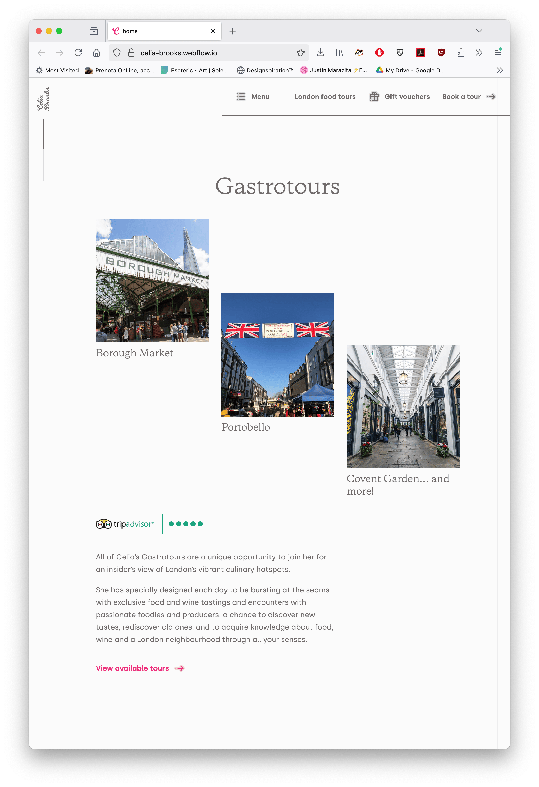
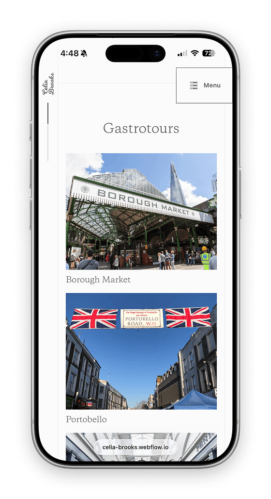
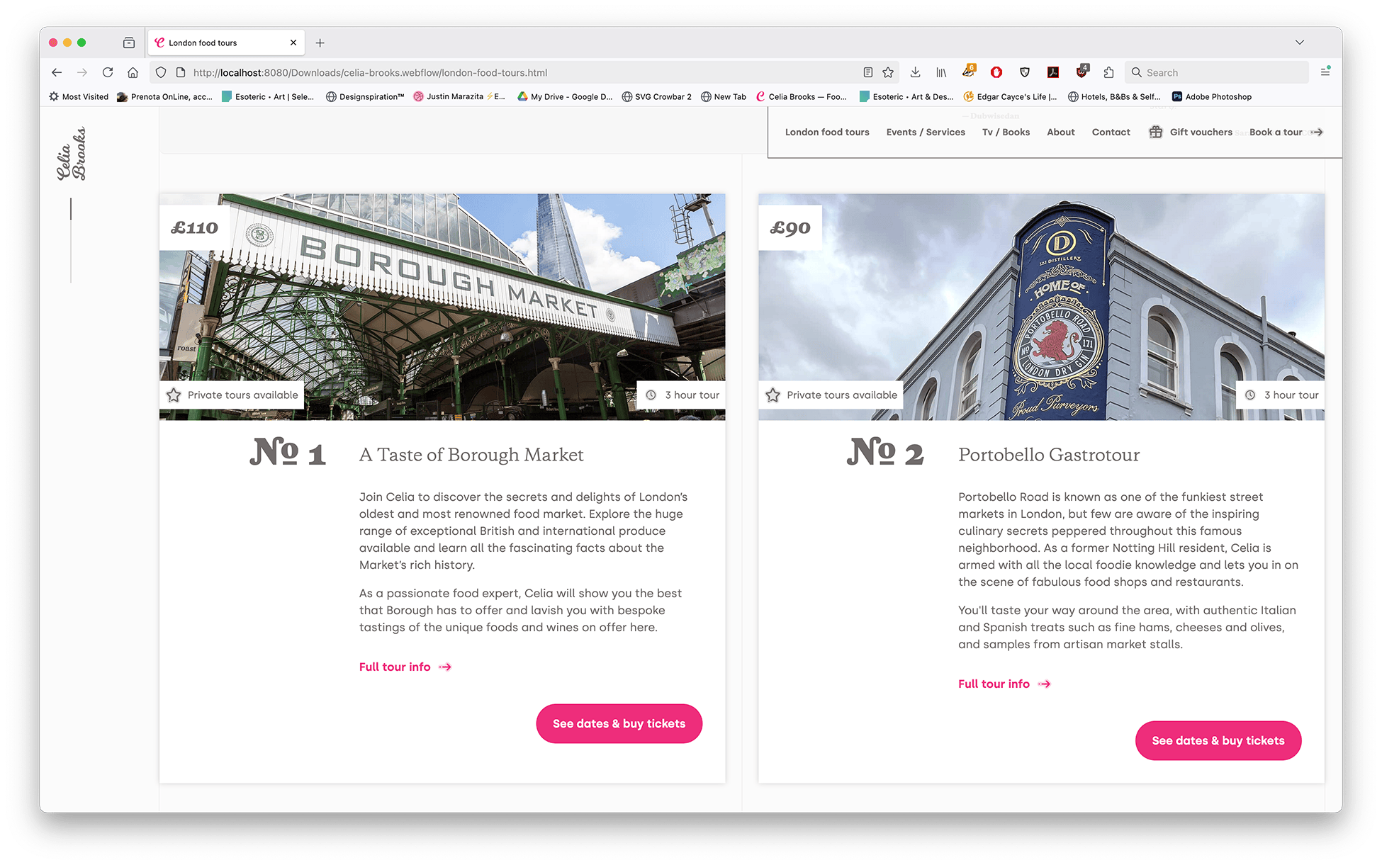
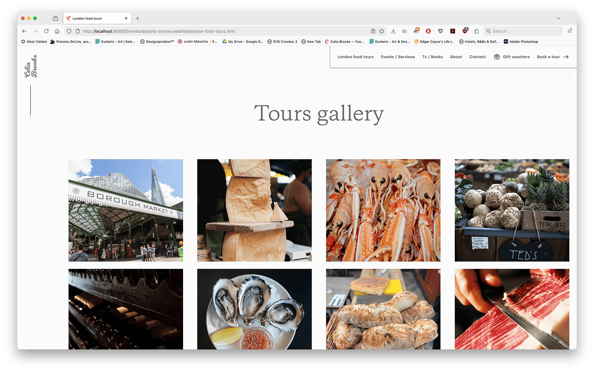
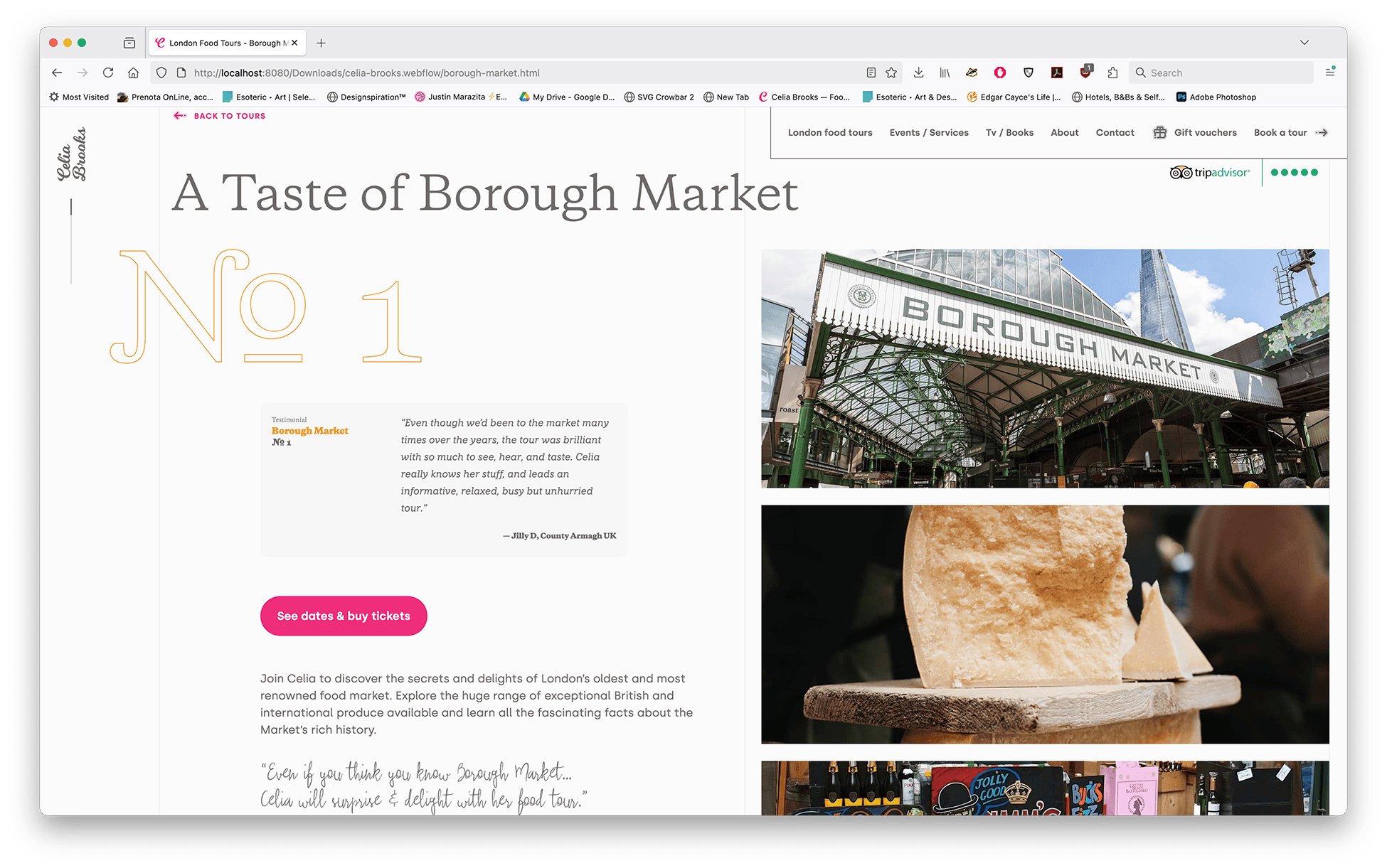
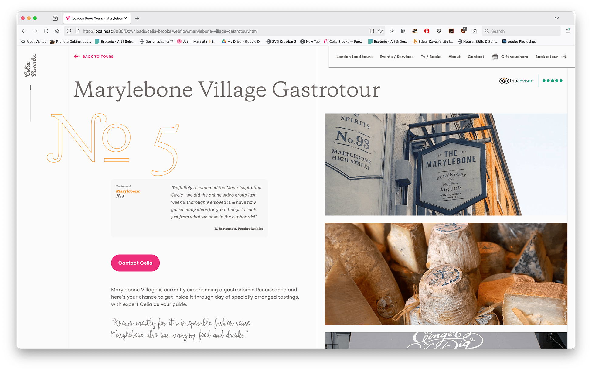
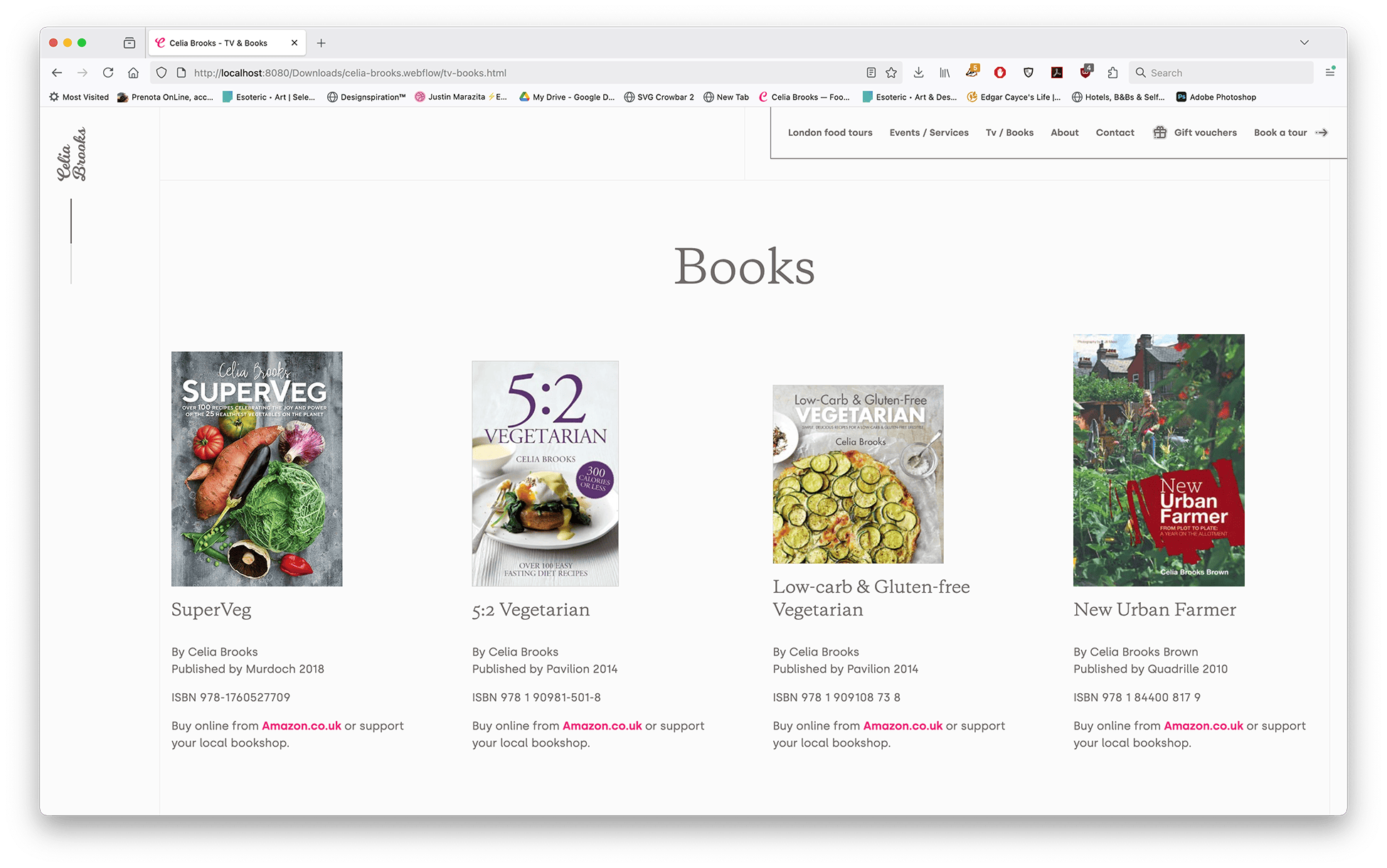
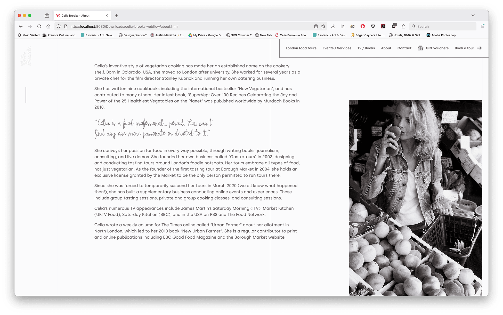
Celia Brooks describes what she does on her business card with two words: Food Expert. That period at the end is important. Spend five minutes with her and it becomes obvious that she is incredibly knowledgeable about the food world. Not only does she have nine published cookbooks, but she has her own London food tour company called Gastrotours. Originally, she was the only person licensed to run tours at Borough Market, and now collaborates with one other licensed tour to keep the spirit and character of Borough Market intact.
On the first project I did with Celia she was running her tours solo. Since then, she has grown to a team of six, bringing with it a whole new set of challenges and business requirements.
With these new requirements I needed to:
- Refresh her branding and website
- Realign her messaging for the new evolution of her business
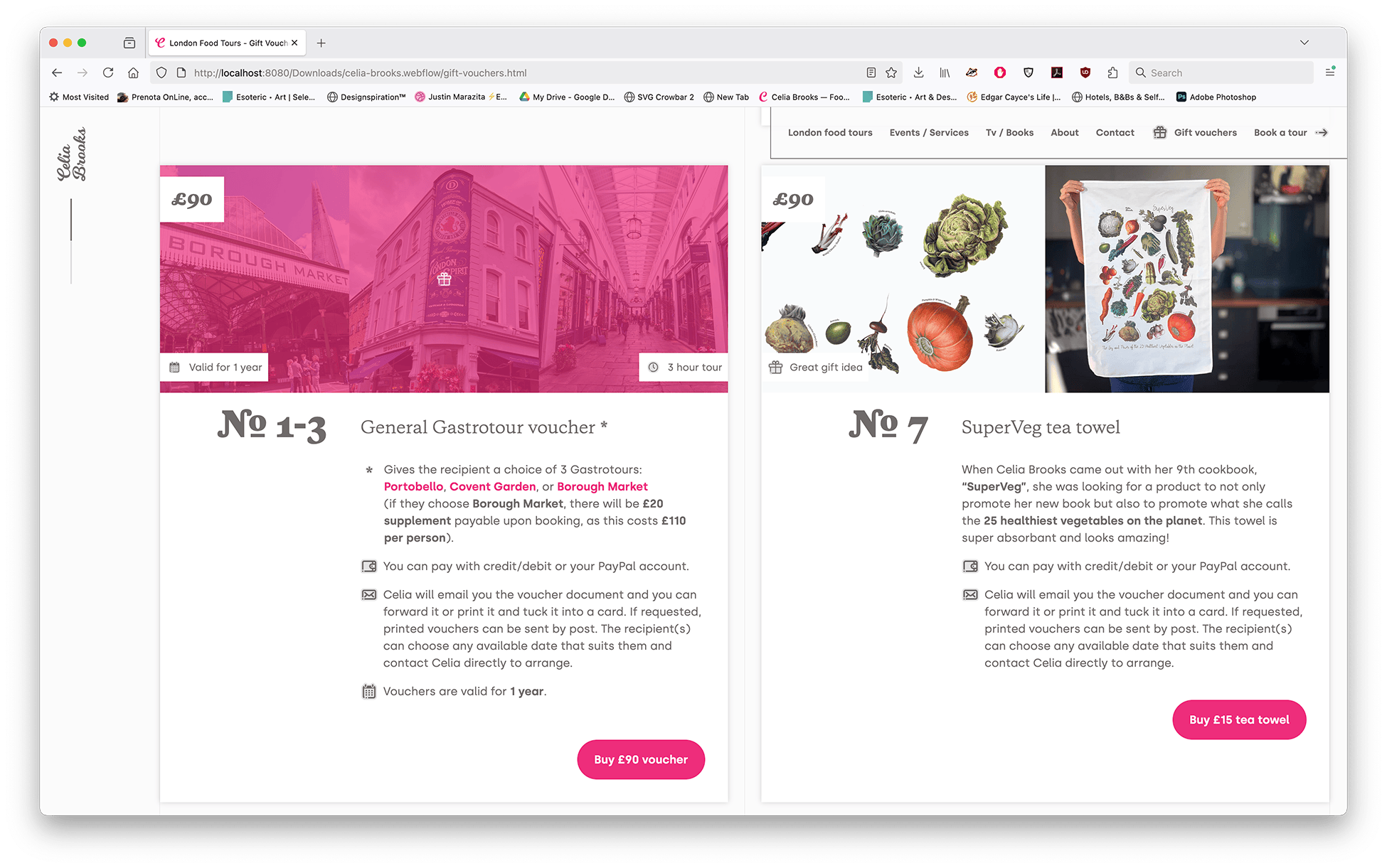
- Ease automation for buying her tours and vouchers, again…
- Integrating a good CMS for all her new employees to streamline communications
Development & content
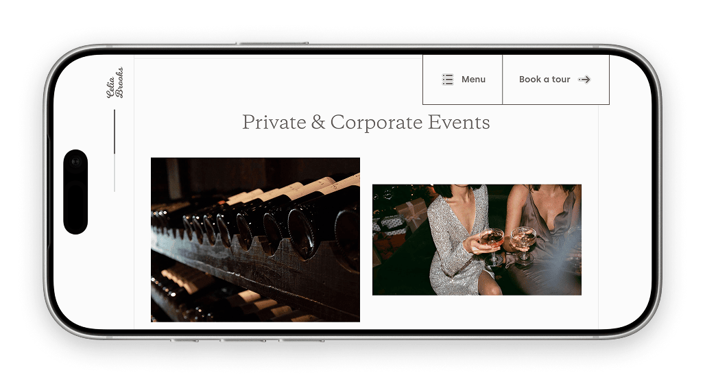
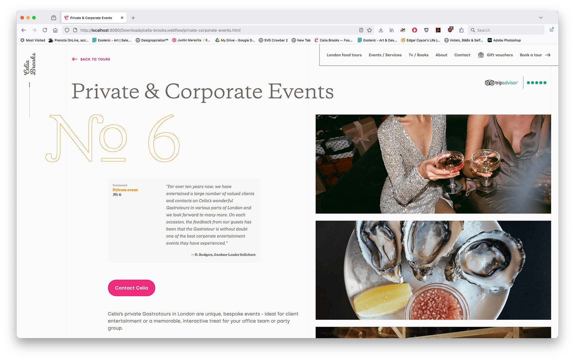
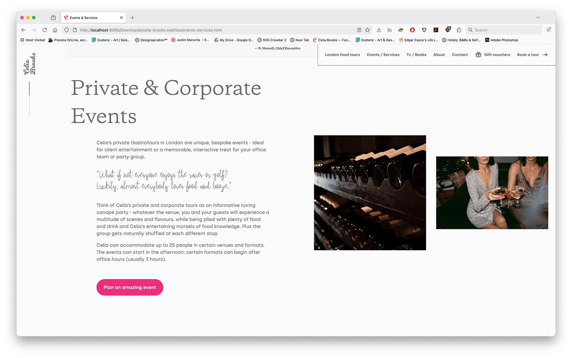
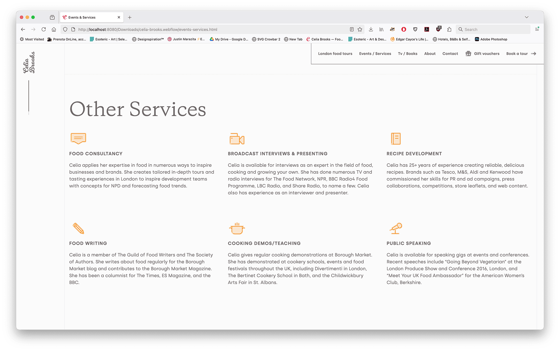
Originally, Celia's services spanned several different facets - food tour guide, TV personality, food writer, consultant, journalist, public speaker, teacher and recipe developer. Maintaining focus across all of these from a business perspective was a lot for one person to manage. For this redesign, she wanted to highlight the services that drive her business most and streamline her content. One example of this is a sharper focus on corporate events, which now make up the bulk of her food tour business, when that wasn't the case before.
Celia remains available for her other services on request, but they no longer needed to compete for attention on the site. The goal was to give the majority of visitors a clearer, faster path to what they were actually looking for.
Personas
Over the last decade since the last project, working with various businesses and dedicated UX teams has taught me a great deal about user-centered design. It's been fascinating to observe how UX has evolved since I first worked with it in its infancy.
For Celia's original project I created several personas that proved just as relevant to this redesign as they were back then. I added a few new ones to reflect her updated business plan and the new challenges that came with it. Together, these helped keep the focus on the user. Which made sure the right information was easy to find and the journey through the site felt intuitive.


Refreshing Celia’s brand
For Celia's first website I took inspiration from her theatre background. She had wanted to become a theatre director when she first moved to London. Cooking and her tours were like a theatre production: She brings together all of these different elements of tastes, knowledge and experience and presents it to the world. The design reflected that kinetic energy, with overlapping elements and a sense of movement.
For the refresh she wanted something more refined and timeless, while still carrying a trace of that original kinetic energy. Given her years writing for the BBC and other outlets, I decided to mirror a high-end magazine spread. With the content anchored by a strong grid system with enough personality to keep it from feeling too static.

Logo redesign
Part of this project was a redesign of her original logo. I chose a more swooping typeface with fun flourishes that felt true to Celia's personality. The flourishes were animated for use in future video work and anything else requiring motion. The animation was used on the Amazon prime episodes Goddess of Veg in which Celia starred.
Typography
For most projects I work with a single typeface family… two at most if an accent is needed. It keeps things clean and is also cost effective for start-ups and small businesses.
For this project we wanted to mirror the feel of a high-end magazine spread, which opened up the typographic selection considerably. I carefully curated four typefaces, balancing them so each had its own role while the overall combination still felt elegant and not overpowering.


Iconography
When I first created icons for Celia’s website, I was looking for some special flair to help them have a life of their own and still be fun.
The inspiration came from an unexpected place. On her business card is says "Food expert." That period at the end helped me find what I was looking for: punctuation that drives home the point. Time. Calendar. Mail. Period.
The original icons were made almost ten years ago during what I can only describe as a rebellious design phase. I built them at 36px square… at least it was based on a 4px grid system. Revisiting them for this rebrand, I wanted every detail to feel cohesive, so I recreated them at a more standard 24px size. Still pixel perfect of course.
Responsive website
I created five breakpoints for this project. The largest allowed for a more authentic magazine experience. As displays continue to get bigger, I wanted the design to feel just as engaging on a widescreen monitor as it does on the smallest mobile phone.
Launching the product
Identifying a few key challenges
Celia uses a service called Anyroad to manage her tours and handle communications between her team through their CMS. It's so intrinsically tied to her day to day operations that moving away from it wasn't an option, even if it meant some compromise on the user experience.
Ideally there would be a seamless shopping system where customers could purchase multiple items, check out in one go, and apply voucher codes directly on the site. Given Webflow's e-commerce limitations, replicating Anyroad's functionality would have required several Zapier connections. This would introduce more potential points of failure than I was comfortable with. It's something I hope to revisit down the line.